Common Lighting Placement Mistakes: Fixes for Each Room
Even good fixtures can perform poorly when they are placed in the wrong spot. Poor lighting placement often causes glare, harsh shadows, dim corners, awkward sight lines, and wasted light that never reaches the area that actually needs illumination.
This guide explains the most common lighting placement mistakes in kitchens, bathrooms, living rooms, bedrooms, and outdoor areas so you can plan a setup that looks better and works better from day one.
Quick Answer
Most lighting placement mistakes happen because fixtures are installed too high, too low, too close, too far apart, or in positions that create glare and shadows instead of useful coverage.
- Space recessed lights based on ceiling height, not guesswork
- Place task lighting where your body will not block the beam
- Avoid putting bright fixtures directly in common sight lines
- Use side lighting at mirrors instead of relying on one overhead source
- Match dimmers, bulb types, and switch locations to how the room is used
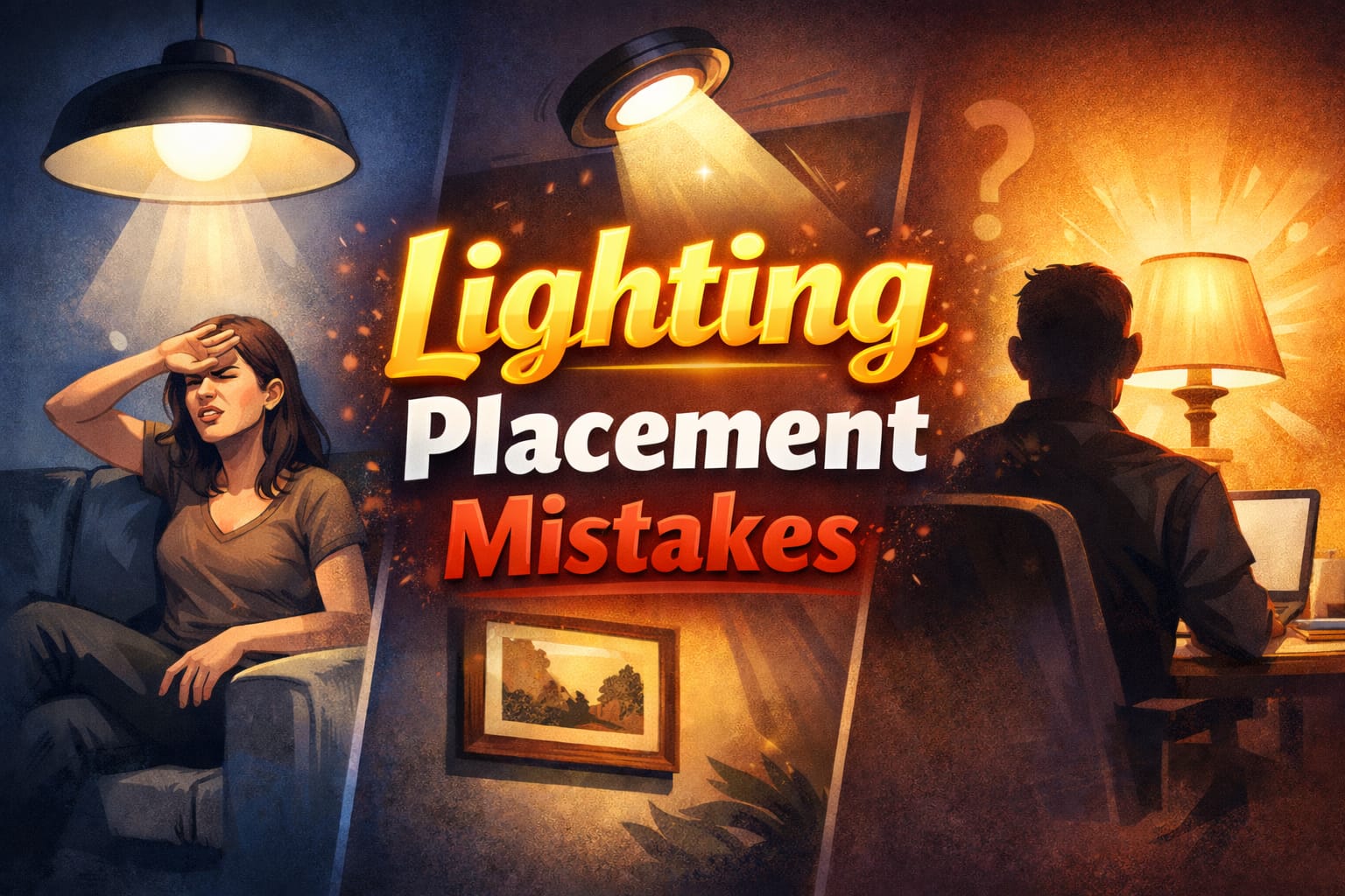
Table of Contents
Recessed Spacing Errors
Poor spacing between recessed downlights is one of the most common lighting placement mistakes in both remodels and new builds. Fixtures that are too far apart leave dark gaps, while fixtures that are too close create overlapping pools of light that feel harsh and waste output. A useful starting rule is to space recessed lights at about half the ceiling height, so an 8-foot ceiling often works well with roughly 4 feet between fixtures.
Wall spacing matters too. Recessed lights usually perform better when they sit around 18 to 24 inches away from the wall instead of being pushed right against it. That offset helps the wall look evenly lit rather than leaving a dark band around the perimeter, even when the room has enough total lumen output.
Vaulted and sloped ceilings complicate the layout because the distance from fixture to floor changes across the room. Higher mounting points often need wider spacing, while angled ceilings may need an uneven pattern to keep illumination consistent. The U.S. Department of Energy’s LED lighting guidance also highlights how good layout improves efficiency by reducing redundant overlap.
If you want a better foundation before placing fixtures, this guide to ambient, task, and accent lighting explains how each lighting layer should work in a room, while our beginner guide to lighting design covers the planning principles behind effective placement.
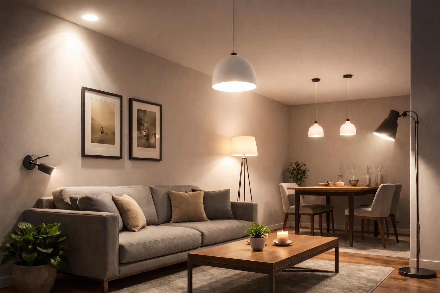
Overhead Fixture Height
Pendant height is one of the easiest details to get wrong because a fixture can look visually balanced but still be impractical in daily use. The right height depends on whether the light is serving a dining table, a work surface, or a bar-height counter.
Dining Table Pendants
Pendants above dining tables usually work best when the bottom of the shade hangs about 30 to 36 inches above the tabletop. That range gives you strong light on place settings and centerpieces without blocking sight lines across the table. Hang the fixture too low and people get direct glare in their eyes. Hang it too high and the table loses the focused light that makes the fixture useful.
Long tables with multiple pendants need consistent spacing and matching drop heights. On a 72-inch table, three pendants often look balanced when spaced roughly 24 to 30 inches apart. If you need a flexible fixture with stable light output, a reliable adjustable lighting fixture can help keep coverage more even across the full dining area.
Kitchen Island Clearance
Kitchen island pendants usually need similar or slightly more clearance because the surface is used for prep, serving, and standing conversation. A bottom height of about 30 to 36 inches above the counter is a strong starting point for most kitchens. Lower than that, fixtures start to feel intrusive. Higher than that, they lose intensity on the work surface below.
Bar-height islands and raised counters need extra attention because seated eye level is higher. In those spaces, pendant height should account for both the counter level and the people using stools, so the fixture does not interrupt sight lines across a multi-level island layout. In connected rooms, our guide to lighting open floor plans can help you keep pendants aligned with the rest of the layout.
Task Light Positioning
Task lights often fail because the beam comes from the wrong direction. When the light sits directly behind you, your own head, shoulders, or hands block the beam and throw shadows onto the area you are trying to see.
For desks, the usual goal is to keep the lamp slightly behind and to the side of your non-dominant hand. That means right-handed users often do best with the lamp on the left-rear side, while left-handed users usually benefit from the opposite setup. This keeps the beam on the page or keyboard without shadows from your arm interfering with writing or detailed work. A more deliberate lighting layout plan also helps avoid these mistakes before a room is fully set up.
Reading chairs work best with flexible fixtures, especially floor lamps or swing-arm lights that can move with different body positions and reading materials. The ENERGY STAR overview of LED lighting points to practical brightness ranges for reading, and in many cases around 400 to 600 lumens is enough for comfortable focused use without excessive brightness.
Computer workstations need a slightly different approach. The light should reach the keyboard and nearby documents without reflecting on the monitor. Lamps to one side of the display usually work better than lights mounted directly above or behind it, because they reduce the chance of persistent screen glare affecting comfort and productivity.
Bathroom Vanity Issues
Bathroom vanity lighting is often bright enough on paper but poorly placed in practice. The biggest issue is relying on one overhead source that throws shadows exactly where you need clear visibility.
Single Overhead Mistake
A ceiling fixture over the vanity may brighten the room, but it usually casts shadows under the eyes, nose, and chin. That makes shaving, skincare, and makeup application harder because facial details do not appear the way they will in more natural light. That is why overhead-only lighting often hides grooming imperfections until you leave the bathroom.
A better approach is to place sconces on both sides of the mirror at roughly face height, often around 60 to 66 inches from the floor. Spacing them about 36 to 40 inches apart helps light the face more evenly and reduces the strong downward shadows that a single overhead source creates. The result is a setup that feels much closer to real-world lighting conditions.
Mirror Bar Height
Horizontal vanity bars above the mirror can also work well, but only when mounted at the right height. Installing the bar around 75 to 80 inches from the floor usually keeps the light slightly above head level, which softens shadows while still directing useful brightness onto the face. Mount it too low and you get direct glare. Mount it too high and it starts behaving like regular ceiling lighting again, which defeats the point of specialized vanity lighting.
Kitchen Counter Problems
Under-cabinet lighting is often installed too far back. When LED strips sit near the rear edge of the cabinet, they brighten the backsplash instead of the counter where prep work actually happens. Mounting the strip closer to the front edge sends more light down onto the worktop and reduces shadows from your hands and upper body during meal preparation.
A simple test with painter’s tape can save you from drilling twice. Temporarily place the strip in a few positions, turn it on, and check where the light actually falls on the counter.
Cabinet depth changes the ideal position. On 12-inch upper cabinets, strips often work well around 3 to 4 inches back from the front edge. On deeper 15-inch cabinets, 5 to 6 inches is usually more appropriate. This proportion-based approach is much more reliable than using one fixed dimension for every cabinet configuration.
Brightness matters too. Highly reflective surfaces such as quartz, polished granite, or marble can create hotspots if the strip is too powerful. In many kitchens, about 200 to 300 lumens per foot is enough, while darker and more matte surfaces can often handle 300 to 450 lumens per foot without creating uncomfortable glare issues.
Bedroom Reading Errors
Bedside lights are often bright enough but badly placed. A lamp that sits too far from the pillow forces the reader to lean forward or hold a book in an awkward position just to stay inside the useful beam.
Table lamps on nightstands usually work better when the light source is fairly close to the bed edge, often around 12 to 15 inches from the pillow zone. That keeps books and tablets inside the most useful part of the beam without forcing the reader to chase the brightest part of the light.
Wall-mounted swing-arm sconces solve many of these issues because they bring the light over the reading position instead of relying on a fixed lamp base. Mounting them roughly 40 to 48 inches above the mattress top usually gives enough range to direct light onto the page while keeping the bulb out of the direct line of sight. They are especially helpful when you do not want to make repeated layout changes after the room is finished.
Shared beds need extra control. Separate reading lights with independent switches and shades that limit spill make it easier for one person to read without disturbing the other. Narrower beams and careful angle adjustment are especially important when one partner is sleeping nearby.
Living Room Glare
Living rooms usually combine screens, conversation areas, and general ambient lighting, so bad placement becomes obvious very quickly. The two biggest issues are television reflections and lamps that light furniture better than the people using it.
Television Viewing Zones
Recessed lights placed directly in front of a TV often reflect off the screen and create distracting glare. Offsetting the fixtures by about 3 to 4 feet from the screen center usually helps you keep ambient light in the room without creating a direct reflection path. That matters because glare is uncomfortable, but a room that is too dark can also increase eye strain during extended viewing. For a broader fix, this guide on reducing lighting glare covers fixture angle, shielding, and diffusion in more detail.
Bias lighting behind the TV is another useful tool. A low-output LED strip on the back of the display can cast a soft glow on the wall and reduce the harsh contrast between a bright screen and a dark room. In many cases, around 50 to 100 lumens per foot is enough for comfortable extended viewing without distracting from the picture.
Seating Area Shadows
Floor lamps directly behind sofas and chairs often throw faces into shadow during conversation. Moving those lamps to the side of the seating area usually gives better reading light and more flattering illumination for people in the room. Side placement keeps faces visible and improves visual comfort during conversation without turning the seating area into a silhouette zone.
Outdoor Security Failures
Outdoor security lighting often fails because the sensor is aimed at the wrong thing. If motion lights point toward the street or a public sidewalk, passing traffic and pedestrians trigger constant false activations that make the fixture less useful over time.
Sensors usually work better when aimed at property-specific zones such as doorways, driveways, side paths, and entry points. Adjustable heads make it easier to fine-tune those zones after installation, especially when trees, shrubs, and seasonal growth affect motion detection reliability.
Mounting height matters too. In many residential setups, placing the fixture around 8 to 10 feet above the ground creates a strong balance between coverage and tamper resistance. Too low and the beam is limited. Too high and the light spreads out so much that ground-level detail becomes weaker right where you want visibility. If you also care about efficiency, our LED energy savings guide looks at long-term operating costs across different fixture types.
Coverage should overlap enough to avoid blind spots, but that does not mean every wall needs a fixture. In many homes, two or three well-placed lights are enough to cover the main approach paths without wasting power on unnecessary overlap.
Accent Light Distance
Accent lighting only looks subtle when the distance is right. Place the fixture too close and you get hotspots. Place it too far away and the effect becomes flat, weak, or too broad to highlight anything well.
Artwork Illumination
Picture lights that sit too close to the frame often create a bright center with dim edges. A more balanced approach is to place the fixture around 6 to 12 inches above the artwork, adjusting the distance based on the size of the piece and the spread of the beam. Larger pieces usually need more distance to avoid strong uneven brightness across the surface.
Track lighting follows the same principle. When the track sits roughly 2 to 3 feet from the wall and the heads are aimed at about 30 degrees, you usually get better spread across the artwork with less glare on glass. That angle also helps reveal texture and brushwork on more dimensional pieces.
Architectural Features
Columns, textured walls, fireplaces, and similar features usually respond well to uplights placed about 12 to 18 inches from the surface. That distance helps produce a cleaner grazing effect that brings out texture without creating harsh bands or uneven patches. In rooms with taller proportions, these techniques often work even better when combined with ideas from our guide to lighting rooms with high ceilings.
Switch Placement
A good lighting plan can still feel frustrating if the switches are in the wrong place. Controls that force you to walk into a dark room before turning on the light are a basic but very common design mistake.
As a general rule, wall switches should sit on the latch side of the door so they are easy to reach as soon as you enter. That applies especially well to bathrooms, closets, bedrooms, and other areas where delayed lighting can create safety hazards at night.
Rooms with multiple entrances often need three-way switching so the light can be controlled from more than one point. Hallways, staircases, and larger living spaces are the classic examples. The wiring is slightly more involved, but the daily convenience usually justifies the extra effort.
A switch height of around 48 inches from the floor is also a practical standard. It is comfortable for most users and aligns well with accessibility guidance, which makes it a smart choice for homes designed around diverse user needs.
Dimmer Compatibility
Dimmer problems are often blamed on bulb quality when the real issue is compatibility. LEDs do not always behave well on older incandescent dimmers, and the result can be flickering, buzzing, dead zones, or a very limited dimming range. Using an LED-compatible dimmer is one of the simplest ways to get smoother control and avoid flickering or unstable output.
Do not mix dimmable and non-dimmable bulbs on the same dimmed circuit. Even if the lights turn on, performance can be uneven, and non-dimmable bulbs may be damaged over time.
Minimum load is another common issue. Some dimmers are designed to work only when a certain total wattage is present, so one or two low-wattage LEDs may not be enough for stable performance. In those cases, a compatible bypass or another properly matched solution may be needed instead of adding extra fixtures just to satisfy minimum wattage requirements.
Mixed bulb types on the same circuit can also cause erratic behavior. Standardizing the bulb type and using compatible controls usually produces much better results. If you want a safer starting point, these flicker-free dimmable LED bulbs are a more reliable fit for dimmed setups, and the broader LED Knowledge Center offers more guidance for advanced configurations.
The big picture is simple: lighting works best when placement follows how the room is actually used. Careful planning avoids expensive corrections later and makes every fixture feel more intentional from the start.
Key Takeaways
Most lighting placement mistakes come down to proportion and direction. Fixtures that are too close, too far apart, too high, or aimed the wrong way create glare, shadows, and uneven coverage even when the products themselves are good.
Before installing anything permanently, think about where people sit, stand, read, cook, groom, and enter the room. A few inches of adjustment in spacing, height, or angle can make a much bigger difference than upgrading to a brighter bulb.
When lighting is planned around real use instead of guesswork, rooms feel more comfortable, more functional, and more visually balanced. That is what turns a basic layout into one that actually works day after day.
Sharing this guide
If you found this guide helpful, save it for later or send it to someone planning a room layout, renovation, or lighting upgrade.
Share using the links below
Interested in learning more? Browse all related articles in our category section.